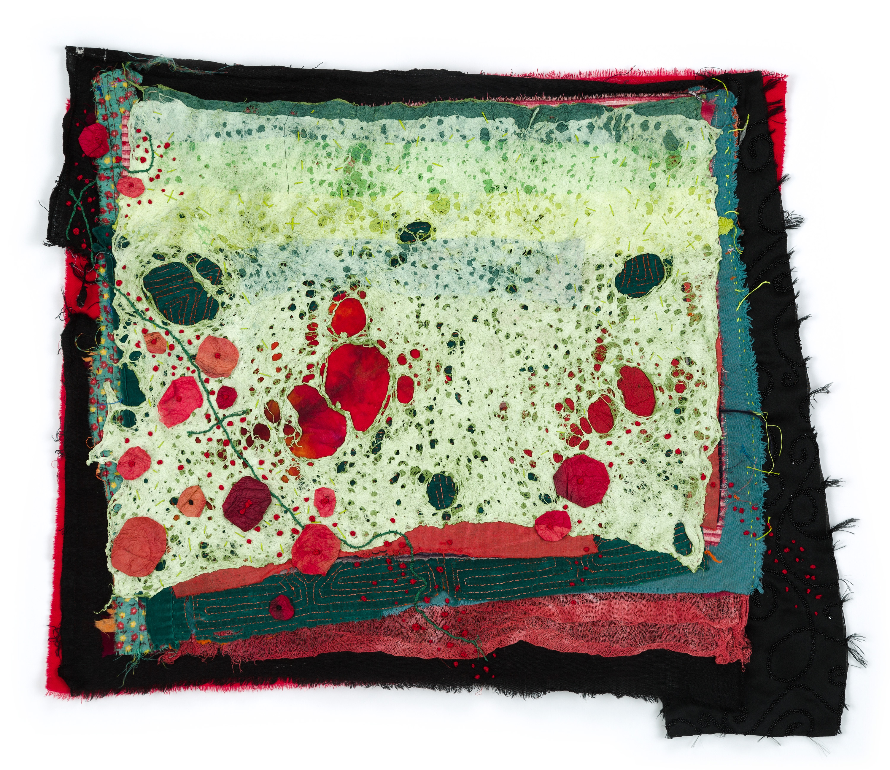
Valerie Mann, Safety Net, 2021, reclaimed fabric and wire, thread, steel, 39″ x 44″
I’ve been a fan of Valerie Mann’s work for years. She is a master at re-imagining the formal potential of discarded and un-loved materials , transforming them into new and emotionally resonant objects and images. I wrote about her recent exhibition “Good Grief” at the Birmingham Bloomfield Art Center for Detroit Art Review. You can read my thoughts on her work here . That show closed on June 1st but now you have a chance to see it re-installed at 22 North Gallery in Ypsilanti . 22 North routinely showcases outstanding art by artists working in Southeast Michigan, but their hours are variable, so call before you go!
Judith and Her Maidservant with the Head of Holofernes by Artemisia Gentileschi, 1523-1525, oil on canvas, photo DIA
During the winter of 2022, The Detroit Institute of the Arts organized a tightly focused but comprehensive survey of masterpieces by women artists of the Renaissance and Baroque periods. “By Her Hand: Artemisia Gentileschi and Women Artists in Italy, 1500-1800” spotlights compelling stories and transcendent artworks by the anomalous female Italian art stars who managed to make remarkable art—and conduct successful careers–in an age when few women had access to the knowledge and tools to make art at all. You can read my review of the exhibition–which closes on May 29– here.
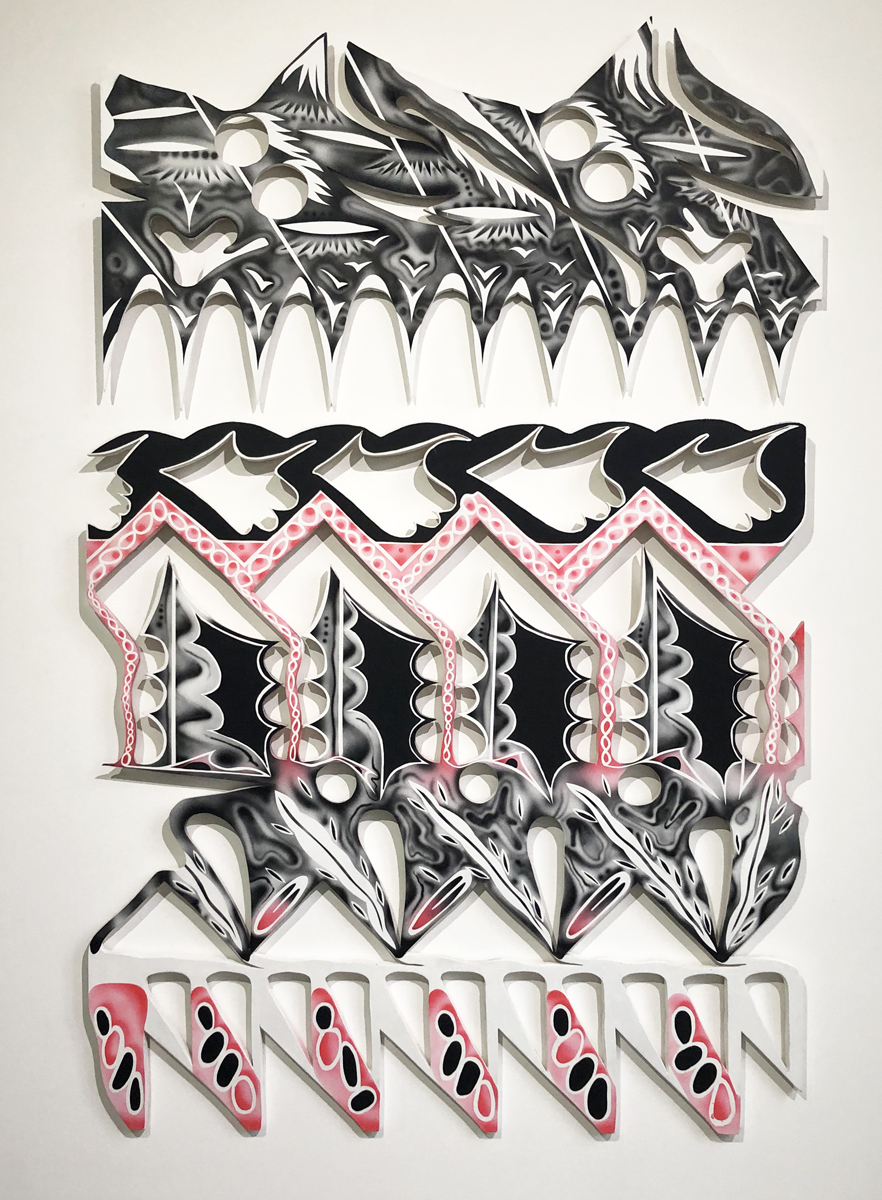
From The Roof Singing by W.C. Bevan, 2021, acrylic on wood, 48″ x 72″
Most Detroiters are familiar with the murals of W.C. Bevan that dot the urban landscape. Less familiar, though, are his smaller scale ink drawings on paper and shaped wall pieces, now on view at River House Arts in Toledo.
Bevan’s large murals are often characterized by highly graphic imagery reminiscent of 30’s hand-drawn animations. Simple elements that suggest fragments of faces or cartoon gestures are repeated rhythmically over the surface of each composition, keeping our eyes in constant motion. As Ryan Standfest of Rotland Press says in Essay’d:
Bevan believes that every object possesses a quality he terms “vibration.” To a degree, this is a scientific fact; everything we see and hear arrives in the form of waves. But Bevan is likely referring not just to this sensory information but also to some other unmeasurable, auratic quality.
Form Gathering/Jigsaw Assembly consists of two distinct bodies of work. A series of several fairly large black, pink and white wooden cutout pieces was created by the artist during the summer of 2021, while Bevan was at work in Toledo on the Glass City River Wall murals. His usual referential imagery is subdued here in favor of more formal elements. Fluid ovals, waves and curves repeat and undulate, evoking for the artist, “sentiments of summers past: picking sun warmed fruits, dealing with midwestern clowns, walking Metropark trails, and existing 100 feet in the air [while working on the silo mural].”
The second (and to my mind, more successful) series of works are his intimate ink drawings, often on vintage commercial papers such as invoices, bills of lading and the like. The muted blacks and subdued pastel colors of these dimunitive pieces introduce an element of nostalgia. Their small scale allows Bevin to create images that are more nuanced and sensitive than his usual larger artworks. They are both quirky and rigorous, and suggest a dreamy carnival.
River House Arts is located at 425 Jefferson in Toledo, Ohio. Hours are by appointment. Form Gathering/Jigsaw Assembly will be on view until January 29, 2022.
Pleased to Meet You by W.C. Bevin, 2021, mixed ink media on paper, 12″ x 8″
The Alchemist’s Dream, a three-person exhibit of work by metalsmith Tom Muir, ceramicist Tom Marino …and me, K.A. Letts, will open tomorrow night at 20 North Gallery in Toledo. The exhibit will be on view until December 24.
I’m delighted to be showing my work alongside these two distinguished artists. For more information about our work, gallery location and hours, go here
Primavera, by K.A. Letts, 2021, acrylic on paper, 38″ x 50″
Crucible Series: Silver Spill by Tom Marino
Twin Risers, by Tom Muir
Origin Story, by K.A. Letts, 2021, acrylic on paper, 38″ x 50″
Mike and Sandy, Salem OH, Lustron Series, 2012-2014, photo Chuck Mintz
My photographer friend, Chuck Mintz will be exhibiting his photographs of the Lustron Houses–and the people who live in them–at the Crooked Tree Art Center in Traverse City until November 13. The Lustron houses were pre-fabricated, enameled steel houses developed in the post-World War II era in the U.S. in response to the shortage of homes for returning G.I.s. There are still some around. Chuck has focused on the current inhabitants and the changes they have made over the years.
Chuck will be making an online presentation October 22 between 10 and 11 a.m. EDT. For more information go here.
And bonus! Crooked Tree Art Center is selling copies of his book, Lustron Stories. Might be time to make a trip Up North.
Lost City #2 by Susan Goethel Campbell, 2020, two-layered perforated woodblock print on Goyu paper, edition of 5, 23.5 x 32 inches, photo courtesy of David Klein Gallery.
Well, here we are in the “summer of uncertain vibes.” It’s not the summer we were hoping for, with masks discarded and indoor dining routine. The pandemic has decided it isn’t quite finished with us yet, but there’s still art out there to see in Detroit.
The folks at David Klein Gallery are taking a glass-half-full attitude to our current predicament, with a colorful and energetic exhibit of work by seven resolutely upbeat artists. Best Times might relieve your Covid anxiety, at least temporarily. The show is on view until August 28, and you can read my full review here.
A Specificity by Ben Pritchard, 2021, oil on panel, 8″ x 10″ photo courtesy of David Klein Gallery
Flowers for Breonna by Carole Harris, 2020, mulberry paper, threads, fabrics, 19″ x 21.5 photo courtesy Hill Gallery
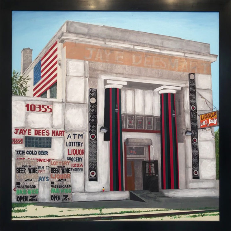
The next issue of New Art Examiner has just gone to press. This time around, I wrote three reviews of Detroit artists. Justin Marshall and Rachel Pontious, both painters, are fairly young and their work, to me, showed signs of the trauma they have endured during the pandemic. Carole Harris, a more established artist, seems to have sailed through the past year, producing a body of work that shows that, at this point, she can really do no wrong. You can read my review of her solo show at Hill Gallery here.
Seven of Swords by Rachel Pontious, oil on canvas, 96″ x 60″ photo by Samantha’s List
You can read my review of Rachel Pontious’s solo show Mise en Abyme at Playground Detroit here.
Jay Dee’s Mart by Justin Marshall, 2020 acrylic on canvas, 48″ x 48″
You can read my review of Justin Marshall’s solo show The End at Public Pool here.
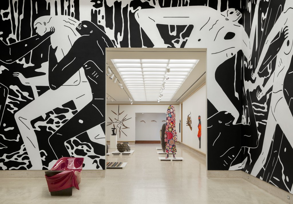
Installation at Cranbrook Museum of Art, Mixing Chamber in foreground
With Eyes Opened surveys the history of Cranbrook Academy since its official founding in 1932. With more than 250 works representing the various programs of study at the school, the exhibition is a huge, somewhat disorganized, survey that’s full of treasures. To read the official account you can go here. I wrote a review of the show for Detroit Art Review which you can read here.
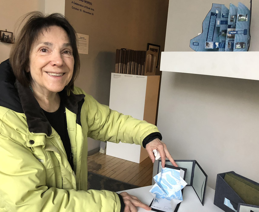
I recently wrote a review of the exhibit Beyond Words, at WSG Gallery, for Ann Arbor’s online culture magazine Pulp. The eighth in a series of group shows featuring book art by Great Lakes regional artists, Beyond Words was curated by Barbara Brown. To read more, go here
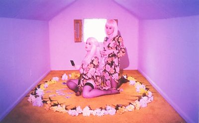
Pretty Queer, a provocative summer exhibit at River House Arts, closed on August 5 but lingers in the memory as a thoughtful echo of one of contemporary art’s most vexed and vexing preoccupations. The artists in Pretty Queer want us to know that gender identity and gender normativity are far more thorny and ambiguous subjects than we thought, and there are as many shades of sexuality as there are humans to express them.
Over the last fifty years, the issue of alternative gender and sexual identity has taken the foreground in public discussion of how people love, present themselves and interact with the broader culture. The spectrum represented by the initials LGBTQ has fractured, with distinctions increasingly finely sliced and diced, atomized and reconstituted. Pretty Queer is an effort to quantify and enumerate some of these distinctions as they exist now, in this historical moment.
Untitled by Troy Hoffman
Pretty Queer’s premise is anchored in the exhibit by a work of the late David Wojnarowicz, an art polemicist who is enjoying a moment in the art world now that contemporary concerns with gender identity have caught up with his pioneering AIDS activism. The serigraph, Fire and Water (1990), projects a sense of dislocation and peril, multiple images of a confrontational pugilist overlaid by a grinning red devil. (Wojnarowicz is currently the subject of a retrospective at the Whitney Museum, David Wojnarowicz: History Keeps Me Up at Night.)
The works in Pretty Queer are characterized by a desire to act out and a countervailing compulsion to conceal which might be a core of the queer aesthetic, described by academic sex researcher Iain Morland as “the sensory interrelation of pleasure and shame.” A number of the works in the show address the artists’ compulsion to show themselves as they are, accompanied by a pervasive sense of discomfort in this self-exposure.
Pink Planter by Zachariah Szabo
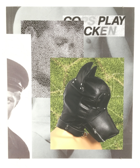
Troy Hoffman has nailed this ambivalence with two digital prints. The first is a small, lush close-up of what appears to be a bed of roses, the centers of which turn out to be human anuses. It’s comic, pretty and deeply disturbing. It’s unclear to me what he means by his other entry, a digital collage of a sado-masochistic dog mask on a female human, overlaid by fragmented black and white images of policemen, but it’s one of those images that, once you’ve seen it, you can’t un-see it.
Fiber artist John Paul Morabito has taken a more reticent approach. His woven pieces Frottage 052 and 049, are woven tapestries that at first appear to be elegantly minimalist until (upon close inspection) ghostly images of genitals become visible.
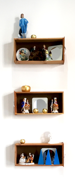
Boys Wear Blue by Robert Fitzgerald
Several of the artists in Pretty Queer have chosen kitsch imagery and objects to describe their response to received gender norms. Robert Fitzgerald’s Boys wear Blue is an example: A set of three deceptively demure boxes contain reproductions of 18th century china figurines in the act of “performing” masculinity and femininity within the confines of a box (could his meaning be any more transparent?) By adding a small mirror in each box, the artist invites the viewer to place him/her/their self in relationship to given norms of gender behavior. Atop and outside the top box, a china figurine rests, his back turned in a gesture of rejection.
Across the room, Zachariah Szabo returns to the subject of kitsch as a received view of norms, turning the concept on its head with irony and humor. The ultra-adorable china figurine in Pink Planter seems to say “ You want cute? I’ll give you cute!” It calls to mind pieces by Jeff Koons (Balloon Dog, anyone?) but with a sharper satirical edge. Colton Clifford’s digital print of two identical, stereo-typically feminine figures surrounded by flowers and formally arranged and constrained within an under-scale dollhouse continues and amplifies the critique on received gender norms.
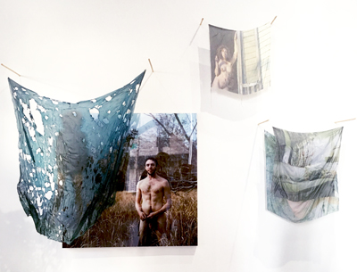
Perhaps the most comprehensive and ambitious exploration of queer/gender issues is the large, mixed-media montage by Rowan Renee. Part memoir, part political polemic, the installation recounts a dispute over ownership of nude photographs of the artist with their then-partner and now-adversary, set against a backdrop of gender transition. In a statement, Renee describes their method: “My labor-intensive process centers on the obsessive act of material transfiguration to recast a relationship I am ashamed of into the pleasure of artistic production.”
Together But Separate (detail) by Rowan Renee
Pretty Queer, in my opinion, does a good job of placing us within the discourse on gender and sexuality in 2018. The question that comes to mind, though, is what will this discussion look like in 2028? Or 3028? It seems clear that we are in the midst of an evolution that is headed for parts unknown, but one hopes it will get us to a future where equality and respect for difference prevail, when we can be content to merely call ourselves human.
For more information about Pretty Queer and Contemporary Art Toledo visit https://www.catoledo.org/pretty-queer . Artist/arts blogger Loraine Lynn has written a thoughtful review of Pretty Queer which you can access here


 I recently wrote a review of the exhibit Beyond Words, at WSG Gallery, for Ann Arbor’s online culture magazine Pulp. The eighth in a series of group shows featuring book art by Great Lakes regional artists, Beyond Words was curated by Barbara Brown. To read more, go