
Pretty Queer, a provocative summer exhibit at River House Arts, closed on August 5 but lingers in the memory as a thoughtful echo of one of contemporary art’s most vexed and vexing preoccupations. The artists in Pretty Queer want us to know that gender identity and gender normativity are far more thorny and ambiguous subjects than we thought, and there are as many shades of sexuality as there are humans to express them.
Over the last fifty years, the issue of alternative gender and sexual identity has taken the foreground in public discussion of how people love, present themselves and interact with the broader culture. The spectrum represented by the initials LGBTQ has fractured, with distinctions increasingly finely sliced and diced, atomized and reconstituted. Pretty Queer is an effort to quantify and enumerate some of these distinctions as they exist now, in this historical moment.

Pretty Queer’s premise is anchored in the exhibit by a work of the late David Wojnarowicz, an art polemicist who is enjoying a moment in the art world now that contemporary concerns with gender identity have caught up with his pioneering AIDS activism. The serigraph, Fire and Water (1990), projects a sense of dislocation and peril, multiple images of a confrontational pugilist overlaid by a grinning red devil. (Wojnarowicz is currently the subject of a retrospective at the Whitney Museum, David Wojnarowicz: History Keeps Me Up at Night.)
The works in Pretty Queer are characterized by a desire to act out and a countervailing compulsion to conceal which might be a core of the queer aesthetic, described by academic sex researcher Iain Morland as “the sensory interrelation of pleasure and shame.” A number of the works in the show address the artists’ compulsion to show themselves as they are, accompanied by a pervasive sense of discomfort in this self-exposure.

Troy Hoffman has nailed this ambivalence with two digital prints. The first is a small, lush close-up of what appears to be a bed of roses, the centers of which turn out to be human anuses. It’s comic, pretty and deeply disturbing. It’s unclear to me what he means by his other entry, a digital collage of a sado-masochistic dog mask on a female human, overlaid by fragmented black and white images of policemen, but it’s one of those images that, once you’ve seen it, you can’t un-see it.
Fiber artist John Paul Morabito has taken a more reticent approach. His woven pieces Frottage 052 and 049, are woven tapestries that at first appear to be elegantly minimalist until (upon close inspection) ghostly images of genitals become visible.

Several of the artists in Pretty Queer have chosen kitsch imagery and objects to describe their response to received gender norms. Robert Fitzgerald’s Boys wear Blue is an example: A set of three deceptively demure boxes contain reproductions of 18th century china figurines in the act of “performing” masculinity and femininity within the confines of a box (could his meaning be any more transparent?) By adding a small mirror in each box, the artist invites the viewer to place him/her/their self in relationship to given norms of gender behavior. Atop and outside the top box, a china figurine rests, his back turned in a gesture of rejection.
Across the room, Zachariah Szabo returns to the subject of kitsch as a received view of norms, turning the concept on its head with irony and humor. The ultra-adorable china figurine in Pink Planter seems to say “ You want cute? I’ll give you cute!” It calls to mind pieces by Jeff Koons (Balloon Dog, anyone?) but with a sharper satirical edge. Colton Clifford’s digital print of two identical, stereo-typically feminine figures surrounded by flowers and formally arranged and constrained within an under-scale dollhouse continues and amplifies the critique on received gender norms.
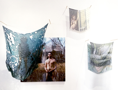
Perhaps the most comprehensive and ambitious exploration of queer/gender issues is the large, mixed-media montage by Rowan Renee. Part memoir, part political polemic, the installation recounts a dispute over ownership of nude photographs of the artist with their then-partner and now-adversary, set against a backdrop of gender transition. In a statement, Renee describes their method: “My labor-intensive process centers on the obsessive act of material transfiguration to recast a relationship I am ashamed of into the pleasure of artistic production.”
Pretty Queer, in my opinion, does a good job of placing us within the discourse on gender and sexuality in 2018. The question that comes to mind, though, is what will this discussion look like in 2028? Or 3028? It seems clear that we are in the midst of an evolution that is headed for parts unknown, but one hopes it will get us to a future where equality and respect for difference prevail, when we can be content to merely call ourselves human.
For more information about Pretty Queer and Contemporary Art Toledo visit https://www.catoledo.org/pretty-queer . Artist/arts blogger Loraine Lynn has written a thoughtful review of Pretty Queer which you can access here

One thought on “Pretty Queer”