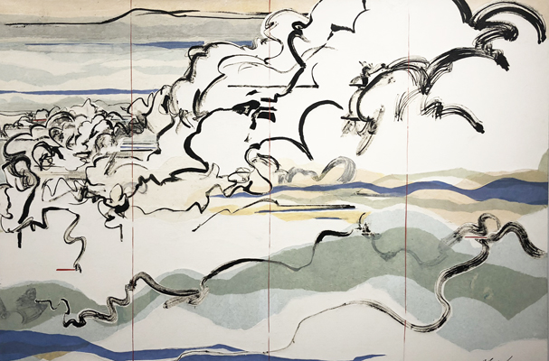
From The Roof Singing by W.C. Bevan, 2021, acrylic on wood, 48″ x 72″
Most Detroiters are familiar with the murals of W.C. Bevan that dot the urban landscape. Less familiar, though, are his smaller scale ink drawings on paper and shaped wall pieces, now on view at River House Arts in Toledo.
Bevan’s large murals are often characterized by highly graphic imagery reminiscent of 30’s hand-drawn animations. Simple elements that suggest fragments of faces or cartoon gestures are repeated rhythmically over the surface of each composition, keeping our eyes in constant motion. As Ryan Standfest of Rotland Press says in Essay’d:
Bevan believes that every object possesses a quality he terms “vibration.” To a degree, this is a scientific fact; everything we see and hear arrives in the form of waves. But Bevan is likely referring not just to this sensory information but also to some other unmeasurable, auratic quality.
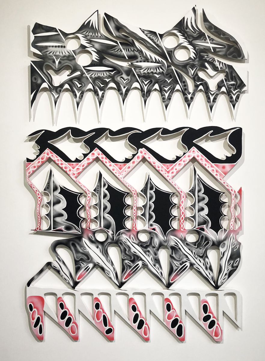
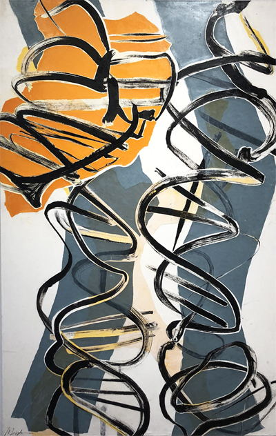
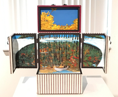
Form Gathering/Jigsaw Assembly consists of two distinct bodies of work. A series of several fairly large black, pink and white wooden cutout pieces was created by the artist during the summer of 2021, while Bevan was at work in Toledo on the Glass City River Wall murals. His usual referential imagery is subdued here in favor of more formal elements. Fluid ovals, waves and curves repeat and undulate, evoking for the artist, “sentiments of summers past: picking sun warmed fruits, dealing with midwestern clowns, walking Metropark trails, and existing 100 feet in the air [while working on the silo mural].”
The second (and to my mind, more successful) series of works are his intimate ink drawings, often on vintage commercial papers such as invoices, bills of lading and the like. The muted blacks and subdued pastel colors of these dimunitive pieces introduce an element of nostalgia. Their small scale allows Bevin to create images that are more nuanced and sensitive than his usual larger artworks. They are both quirky and rigorous, and suggest a dreamy carnival.
River House Arts is located at 425 Jefferson in Toledo, Ohio. Hours are by appointment. Form Gathering/Jigsaw Assembly will be on view until January 29, 2022.
Pleased to Meet You by W.C. Bevin, 2021, mixed ink media on paper, 12″ x 8″
When I walked into Janice Charach Gallery to see PaperWorks in late October, I experienced a moment of profound confusion. Perhaps because I knew that Meighen Jackson, the curator of the exhibit, had been experimenting in her own art practice with the 3-dimensional potential of paper, torn or cut or folded, I expected to see work that reflected a sculptural approach to the material.
I found though, that PaperWorks is not so much a show about paper, but a show of work on paper by 7 accomplished artists with a diverse array of goals and methods. For them, paper is a given, a starting point, an almost transparent means to an end. They have used it as such, working in a range of styles and toward a variety of ends, producing work that spans a broad spectrum of emotional expression and observation.
Swell by Constance Bruner
Diner Party Dress by Sue Carman-Vian
The humorous drawings of Constance Bruner employ the visual syntax of comics and animation, and occupy the expressive end of this collection. She playfully engages in a formal dialog between the paper and the marks she makes upon it, calling her drawings evidence of “a process of navigation between control and impulse, emotion and rational thought.” The series of moves and countermoves that she makes within the bounds of the paper produces lively images that swoop and wiggle on the page. Sue Carman-Vian is likewise an artist bent on expression but in a shadowy, ominous mood that delivers an implied critique of feminine roles and constraints. Her five large charcoal drawings, inhabited exclusively by female figures, possess a sinister, storybook quality. The women are not in danger, precisely, but they seem immobilized. Women at their Heights, places women literally on a pedestal where they are idolized but lack agency. In another drawing, Diner Party Dress, the lone figure is implicitly offered as a commodity, to be admired and then consumed.
Red 1 by Elizabeth Youngblood
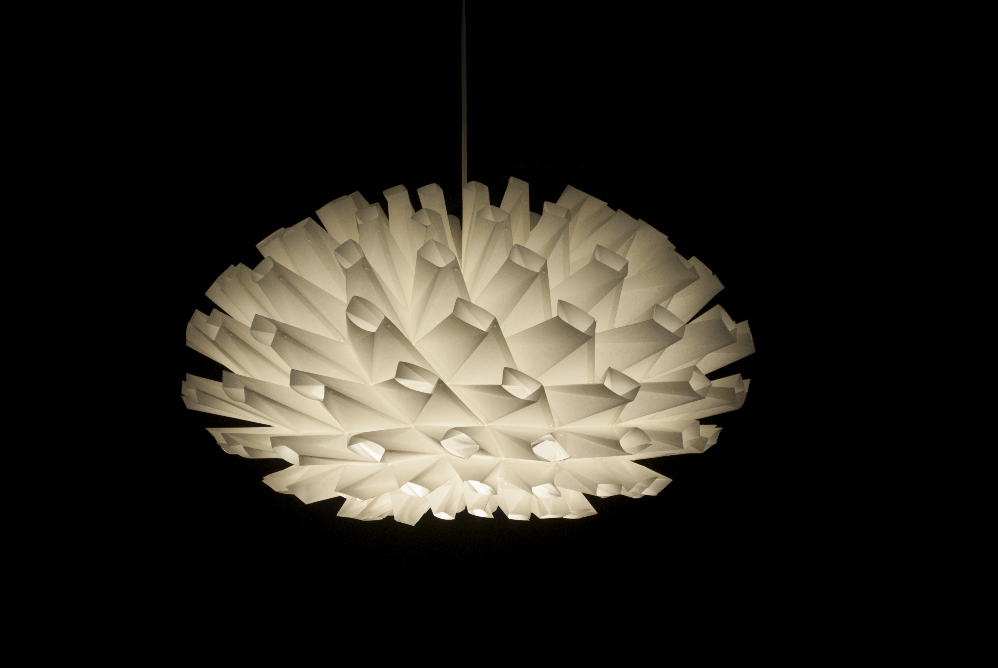
In a more formal –and three-dimensional–vein, Jiangmei Wu describes herself as fascinated by the tactile qualities of folding. Her two elaborately folded pieces, Boreas and Eurus, are lit from within, and suggest symmetrical forms from nature, crystals or single-celled organisms. Her paper folding is simple in concept, but elaborate in effect. She describes her deceptively simple but sophisticated method, ” I use balancing, connecting, hinging, suspending, pulling and popping in my works. I often fold intuitively, oscillating between states of disequilibrium and equilibrium.” Elizabeth Youngblood shares with Jingmei Wu a preoccupation with the formal and process-related properties of her material. In her drawing Red 1, She arrives at her finished image by means of repeating a single gesture. Some of her other work in this collection depends upon the process of pouring aluminum paint onto paper, yielding an image that is both intentional and fortuitous, dependent upon chance but clearly intentional.
Snow Currents I by Armin Mersmann
Pat Duff with ‘the’ Chair by John Hegarty by
John Hegarty and Armin Mersmann occupy the observational end of the spectrum in PaperWorks, and are engaged in intense looking and recording of what they see, though to vastly different ends. Hegarty has had a distinguished career as an artist and teacher, and his keen interest in his fellow human beings informs his ongoing art practice.“Usually what I draw, or paint, are friends,” he says. His life-size drawings of Pat Duff, a friend of long standing whose face and figure he often draws, are deeply humane and closely observed. Armin Mersmann’s obsessively detailed landscape drawings speak to the artist’s preoccupation with visual perception as an avenue to deep understanding. “Drawing gives me the opportunity to truly see,” he explains. He aims to record the truth beneath the surface appearance of things and to convey that sense of the sublime to the viewer.
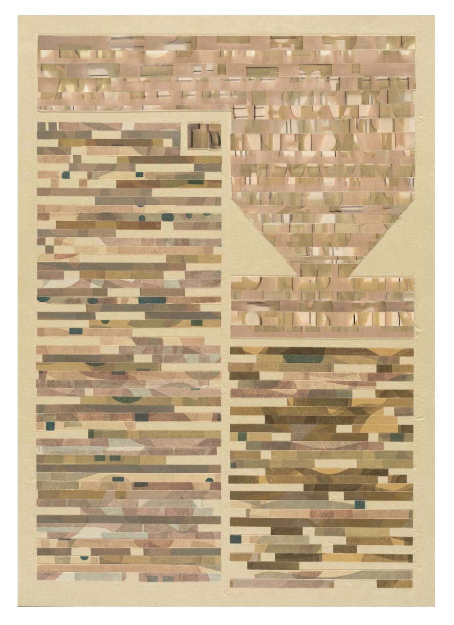
Lynne Avadenka a printmaker, avid archivist of all things printed and student of the printed word as related to the Jewish experience, rounds out this distinguished roster of master draftsmen/craftsmen with 8 mixed media collages entitled Bomberg Variations. The historic version of the talmud referenced in these cut paper collages established the holy book’s page design into modern times and it’s easy to see why. Even without text, the formal dignity of the design conveys an undeniable sense of the ineffable and transcendent.
It appears from the evidence presented in PaperWorks that rumors of the demise of paper as an artistic medium, to paraphrase Mark Twain, “have been greatly exaggerated.” The artists take advantage of paper’s ubiquity and flexibility as a material, finding it a means ideally suited to their diverse ends.
Bomberg Variations V, by Lynne Avadenka, cut paper collage
PaperWorks, curated by Meighen Jackson and featuring the works of Armin Mersmann, Constance Bruner, Elizabeth Youngblood, Jiangmei Wu, John Hegarty, Lynne Avadenka and Sue Carman Vian, will be on view on the main level of Janice Charach Gallery until December 5. For more information go here
Billow and Surge by Meighen Jackson, ink and various art papers on canvas
It’s fitting that Meighen Jackson’s solo exhibit Climb is located at the top of a flight of stairs. Her paintings, drawings and paper constructions, which fill and overflow the second floor space at Janice Charach Gallery through December 5, serve as declarations of her endurance and resilience in the face of life’s inevitable personal blows.
Free, ink and various kozo and vellum papers on canvas.
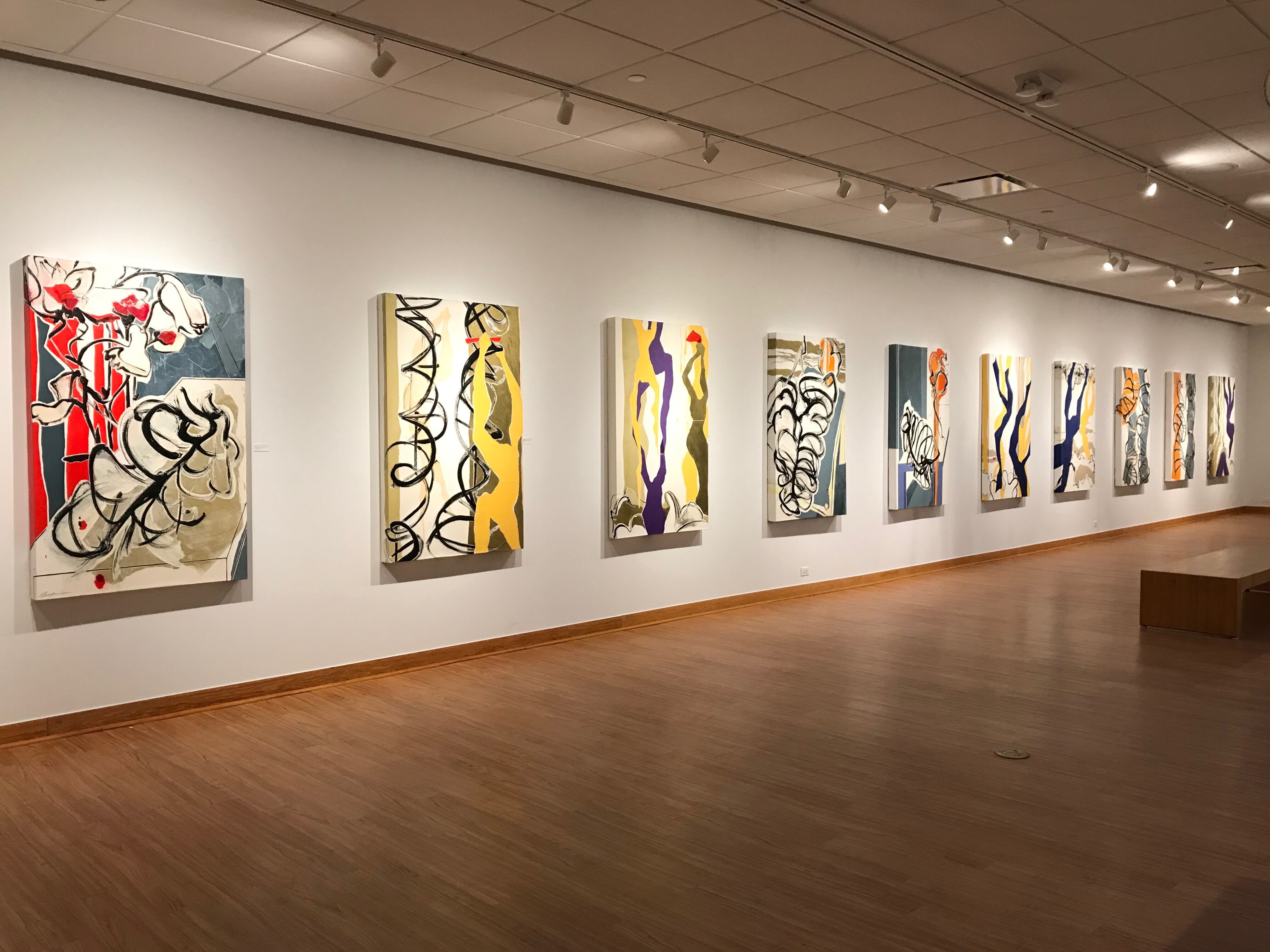
Jackson’s recent work marks a major transition in her art practice, with paintings and drawings that bring the human figure to center stage. In her recently completed series of 10 artworks referencing the figure, lined up along one wall of the gallery, she employs an idiosyncratic process, layering and gluing cut and torn colored art papers on canvas. She then over-paints the surface, and rips and cuts away the featureless white to reveal the vibrant hues underneath. The brutal physicality of her process yields a surprisingly lyrical result. Though she demonstrates her familiarity with the language of modern art history, metaphorically nodding to Henri Matisse’s paper cutouts and Francis Bacon’s fluid, curvy lines, Jackson has arrived at a means of expression that is uniquely her own, a seamless fusion of drawing, collage and painting.
Also included in Climb are many works on paper that showcase her virtuosity, as she wields her brush in elegant calligraphic strokes.In her artist’s statement, Jackson pledges her allegiance to line or, as she puts it: “Lines that begin as solid, upstanding geometric citizens and end, like dying fireworks, in an explosion of dots and scratches.” The 23 black ink on paper drawings that rest in acetate sleeves at either end of the gallery are testaments to Jackson’s creative fluidity and productivity as a draftsman.
Installation, Climb Series, various art papers and ink on canvas
Ranging around the perimeter of the gallery, Jackson continues her ebullient way, painting the movement within waterfalls and cloud formations, with intimations of a few naiads thrown in for good measure. Bits of cut paper applied to the surfaces of the artworks are a consistent element throughout the collection, though they may perform different functions from one composition to the next. At times they form a loose grid that anchors the composition within the picture plane, at others they may indicate the atmospheric hue of a cloud or the motion of water crashing downhill. The constant from one piece to the next is her delight in the natural world.
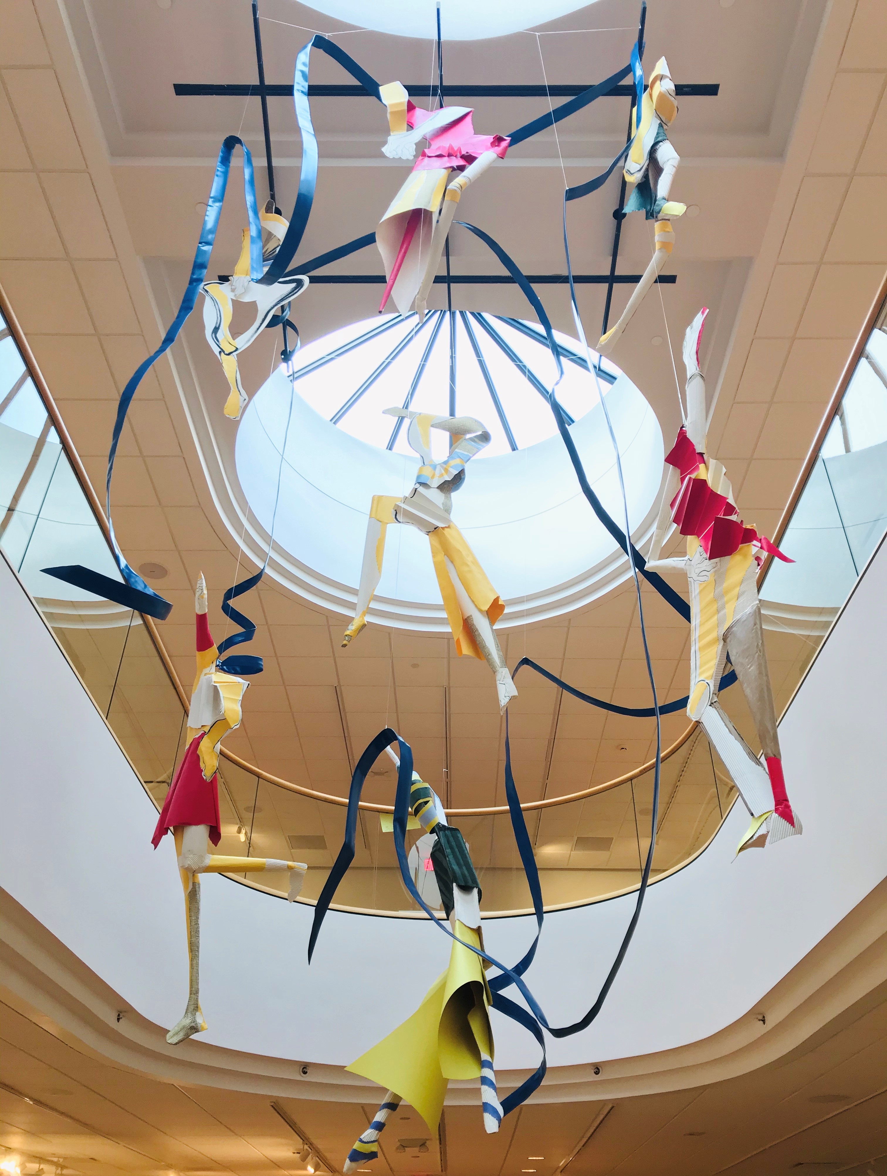
Suspended within the oculus at the center of the gallery, several figurative paper constructions float, suspended. These three dimensional figures represent a new project for Jackson, and they seem to ride the air, like kites or sails. There are endless possibilities suggested by these first steps in a direction that the artist has only begun to explore.
Climb, Installation, paper constructions
Meighen Jackson’s Climb allows us to observe the artist during her journey toward a destination that only she can see. Her exploration of the infinite possibility within her creative practice can only grow as she sharpens her formal tools for the ascent to come.
Chicago artist Deborah Baker, whose large pencil drawings are on view now at Firecat Projects until December 16, 2017, once again demonstrates that the artist’s most creative tool rests between her ears. Baker rejects all currently fashionable media such as video, performance and photography. Even within the constraints of conventional drawing, she avoids decorative or descriptive color and perspectival reality. Through this systematic refusal, she achieves complete freedom within a form of expression that is strongly graphic and psychologically resonant.
Baker can be understood to be a sort of free-associational sign painter, a dealer in archetypes collected and added to the page, where they set up visual harmonics within the composition. The large drawings in 6B are based upon her previous small, black and white embroidered pieces, several of which are in the show. She chose to make her drawings on large sheets of brown kraft paper in order to create larger scale works for 6B.
Baker describes her process: I always start with a word or title. That word evokes images for me …I also always begin with the border or frame first…I do few or no preparatory drawings… sometimes a small thumbnail sketch to get the layout, no marking…though I do fold the fabric to orient the space.
Tied, 17″ x 17″, embroidered linen
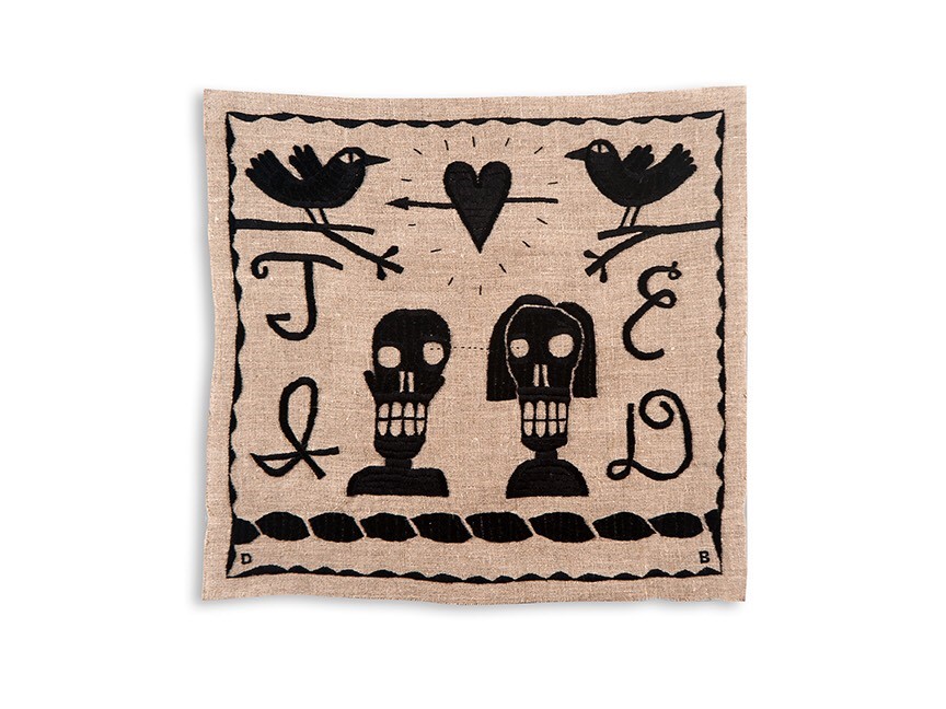
Her previous work with embroidery affects Baker’s compositional choices in the more recent large drawings. There is a kind of steady rhythm to the fabric pieces. Each constituent image is spaced out over the surface of the artwork, creating the impression that the composition must be “read” rather than seen. The patterned border surrounding each embroidery resembles decorative craftwork from the Victorian age, though the images within are more reminiscent of ethnic or folk images, or designs from tattoo art.
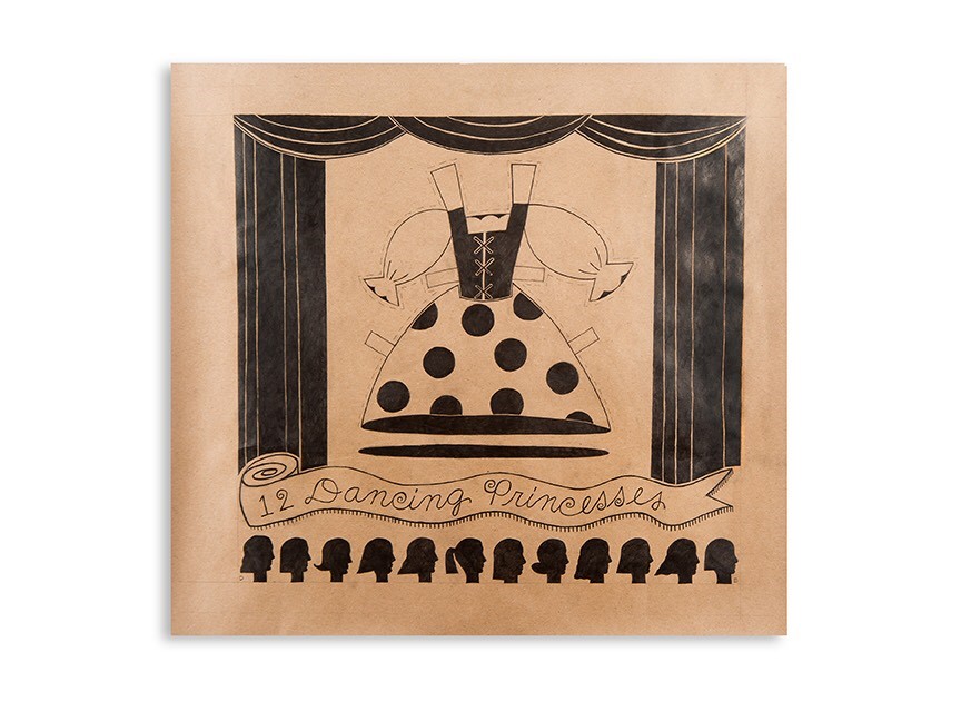
In the large drawings, the decorative designs that Baker uses to define the outer limits of her small embroidered compositions begin to resemble theatre prosceniums, and the compositions become performances. This is especially evident in the drawings Connect and 12 Dancing Princesses (which even includes a suggestion of an audience in the lower portion of the drawing.) She takes a metaphorical step back in Center, which once again recalls Victorian embroidery.
12 Dancing Princesses, 35″ x 40″ 6B pencil on paper
A recurring theme in Baker’s work is the mystery of the long-term loving relationship. It can be no accident that the couples seen in the embroidered Link and Tied, and in the drawing Union are skeletal. “Until death do us part” is not just a metaphor here. In Cryptic, the image of the silhouetted couple facing each other refers both to a famous optical illusion and to the opaque black box of long term commitment as visualized in an all-seeing pyramid. In Hope vs. Hope, love and conflict co-exist.
It’s been said that editing is the only art, and Deborah Baker’s deceptively simple drawings prove it. These large pictures of dancers, hearts and grinning skeletons appear at first blush to be simple, naïve and almost childlike, but upon closer examination are nothing of the kind. The artist has created a complex visual language that allows her complete freedom of expression within the limited means she employs.
For information about Firecat Projects and 6B go here
Wonderland, a frisky selection of imaginative objects and inventive pictures by six of the region’s more talented art players, is on view now through December 2, 2017, at the Walter E. Terhune Gallery in Perrysburg, Ohio. The show’s curator is Brian Carpenter of Contemporary Art Toledo. Wonderland is a kind of artist-created play space for adults who appreciate paradox, irony, humor and originality. Each artist is a skilled practitioner of his/her self-invented game and we are invited to play along.
Avatar/Game Piece by Sarah Rose Sharp
The terms of engagement are established as we enter the gallery. A set of six small game pieces rests on a pedestal, each invented by one of Wonderland’s artists, for a game as yet to be invented. These diminutive avatars range from an intricately carved figure on horseback to a desultory lump of styrofoam. Though there are, as yet, no rules, no board, no start and no finish, some serious play is clearly about to commence.
Heather Accurso describes herself as “dedicated to the visual language of drawing,” and her draftsmanship is indeed a strong suit, but she has added assemblage to the mix. Handmade miniatures in shadowbox settings now enrich and enlarge her drawn and recurring themes.
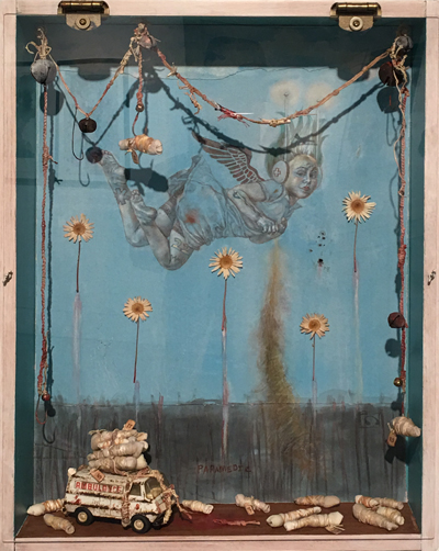
Paramedic by Heather Accurso
In Paramedic, we find a dense composition that combines a narrative of catastrophe with angelic presence. Her masterfully drawn cherub provides the central image in a tiny diorama of disaster. Closer inspection reveals more depth and breadth, as the signs of injury and of medical intervention create a disturbing but intriguing hallucinatory tale of death and ascension.
Adrian Hatfield is an accomplished collagist, cutting and pasting his way to idiosyncratic personal meanings that are more than the sum of their parts. In the diptych Adaptive Radiation and The Morning After he samples and recombines images from art historical sources into baroque scenarios that may suggest the lush before and melancholy after of a one-night stand, or an idyllic Edenic state followed by imagery of environmental spoilage and degradation.
Andrew Kreiger’s small, meticulously constructed and toy-like artworks–or art-like toy works?– draw upon his skills as a maker, as well as his considerable talents as a painter. His opening box construction Van Dyke, Detroit, Facing North/South/East treats us to a miniature panorama of Detroit’s lost pastoral history.
Van Dyke, Detroit, Facing North/South/East by Andrew Kreiger
In Momento Mori #1, Sarah Rose Sharp takes us on a virtual walk through the woods, where we discover a blanket upon which a skeleton rests, partly obscured by leaves and by intimations of surrounding trees. The effect is both macabre and lyrical.
Michael McGillis’s contribution to Wonderland is a single, improbably cut-up and re-assembled combination easy chair and chintz-patterned bulldozer. Phantom Limb is a comic yet poignant stand-in for an amputee, gamely holding itself upright in spite of the insult to its structural integrity.
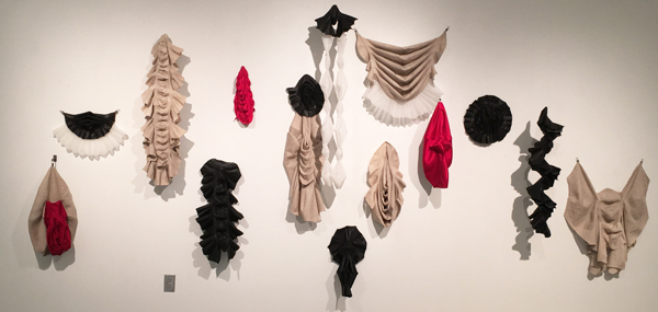
The most mysterious and intriguing contribution to Wonderland is an installation, by Kirsten Lund, of fabric constructs which defy categorization. Lund’s process uses salvaged fabrics and each piece is limited to one individual pattern shape that is then combined and recombined into a range of symmetrical configurations. They pleat, loop, drape, sag and lope across the wall, fantasy costume pieces for an obscure period drama. They clearly reference the human body, but what body–or body part–they relate to remains a mystery.
The artists in Wonderland present us with work that is both serious and playful. It can be thoughtful or silly, but never descends into whimsy. The self-invented games they play are limited only by the structured creative process of each artist. For more information about the Walter E. Terhune Gallery go here.
Momento Mori 1 and Rotations by Sarah Rose Sharp
Phantom Limb by Michael McGillis
Adaptive Radiation and The Morning After by Adrian Hatfield
We live in a hyper-literate age of endless imagery and short attention spans.
We seldom pause–and really, when do we have time?–to consider the process by which we create meaning for ourselves from the constant interaction of words and pictures in books, magazines, on television and the web, on our phones.
In Text/Image, now on view until June 3 in Ann Arbor Art Center’s Gallery 117, Detroit-based artist/curator Jack O. Summers has thoughtfully collected for our consideration some artworks that refer to everyday objects whose meanings “are enhanced or subverted by the multi-dimensional interplay of text and images.” The exhibit concentrates on still imagery, leaving aside the more kinetic treatments of text and image interaction such as video and animation.
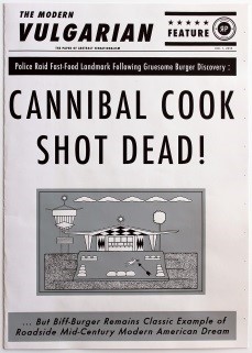
There are several artists represented in Text/Image who are well known in Detroit for their absurdist take on the news and pop culture, using the vocabulary of comics and newspaper to communicate their point of view. Ryan Standfest, gifted printmaker, founder of the Rotland Press and trickster artist, composes headlines for his imaginary tabloid newspaper the Modern Vulgarian (#1) that raise more questions than they answer and classified ads that go gleefully off the rails.
The Modern Vulgarian #1 by Ryan Standfest
William Schudlich, illustrator and self-proclaimed “social zoologist” is clearly a kindred spirit. Schudlich’s images employ the visual vocabulary of disposable print media such as comic strips and have the look of early to mid-20th century comics. He approaches visual challenges, he says, “with a dark sense of humor whenever possible.” Tom Carey’s large relief prints, while ostensibly mining the same classic content as Schudlich and Standfest, project a more modern effect with their vivid colors and lively compositions. The small wooden mutoscopes (flipbooks in wooden boxes operated by pushbutton) created by Andy Malone also fit comfortably with the sensibilities of Schudlich and Standfest by appropriating of a vintage craft and re-purposing it to make a modern statement.
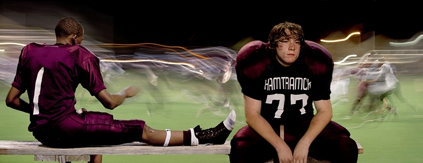
Two notable Detroit photographers, Christopher Schneider and Bruce Giffen, appear in Text/Image. In Schneider’s Underdog, the word “Hamtramck” printed on the young football player’s jersey adds context and pathos to the inward-looking figure, isolated as his teammate looks away toward the light and movement of the game. His fellow photographer Bruce Giffen, whose sharp and poetic eye is trained on Detroit at all times and in all seasons, juxtaposes text with context for special resonance in his photo Stay In School.
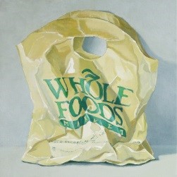
Whole Foods by Jaye Schlesinger
Taurus Burns, Dencel Deneau, Jaye Schlesinger and Amy Fell all engage in the reification of the ordinary, each one observing with care and archiving with skill the unglamorous objects and often unsightly minutiae of the urban landscape. Deneau’s small glass mosaics, in particular, are improbably lovely memorials to fleeting moments in the life of a city.
Moving from the grittily observational to the poetic, Scott Northrup’s gauzy collages are cinematic and nostalgia-soaked. Self-Portrait with Fruit by John Gutoskey is somehow both cheerful and sad, and recalls the innocence and the pain of a young boy growing up gay in the Midwest. Like Gutoskey’s quasi-installation, Believers by Catherine Peet hardly needs text to make its point, harking back to medieval altars of a pre-literate age.
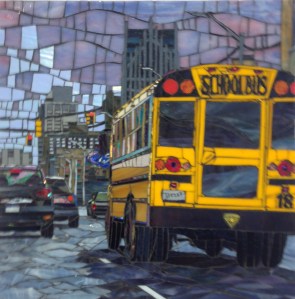
School Bus by Dencel Deneau
Before the printing press and universal literacy, the visual impact of letters was as important as the narrative meaning. Randy Asplund creates contemporary works using the same methods as medieval illuminators; the pigments, grounds, text and image are all carefully chosen for their symbolic resonance, each re-enforcing the meaning of the other elements. Taking the opposite tack, Alvey Jones subverts the meaning of text in Language Text and Circuit Board. Each element of the artwork is designed to be unintelligible–the book is (literally) Greek to us, the circuit board holds its meaning in a code we are unable to penetrate.
Barbara Brown, eminent Ann Arbor book artist and curator of a yearly survey of all things art and book-related, entitled Beyond Words, here uses her collection of handmade building blocks, Metropolis, to think playfully about the way reordering words or letters can alter narrative.
Text/Image can be understood best as a survey featuring a cast of accomplished artists, any one of whom could fill the gallery with well-crafted and well-thought-out work. The art in this exhibit thoughtfully uses language and image together to address a variety of themes from autobiography to social commentary, and while curator Jack O. Summers has put together an interesting and beautiful exhibit, the subject is far from exhausted and possibly never can be.
It’s a well-known fact that few visual artists working here in the Rust Belt have a realistic hope of making a living exclusively from selling their art. So many find themselves teaching to make a living while also trying to keep up their studio practice and actively showing their work. This requires energy, dedication, resourcefulness and maybe an ability to do without a full night’s sleep. The show currently in Gallery 117 displays the diverse skills of the hardworking artists who give instruction at the Ann Arbor Art Center, from printmaking to painting to ceramics to animation and more. In a show of this kind the technical mastery of each artist is on display, and the artworks have to be enjoyed for their individual charms rather than appreciated in relation to an overarching theme. The level of skill on display is impressive, as one would expect from an instructional staff that is tasked with teaching the technical aspects in their area of expertise.
War Baby by Heather Accurso
I came to the exhibit already knowing the work of some of the artists represented, among them Heather Accurso. I’ve liked Accurso’s drawings ever since I discovered them at Packer Schopf Gallery in Chicago. Yet another MFA graduate of the School of the Art Institute of Chicago, she is a skilled draftsman who employs the image of a baby repeatedly– possibly obsessively –in her precise and surreal drawings.
Another artist with whom I was already familiar and whose work I like is encaustic painter Beth Billups. Her charming, childlike compositions occupy the aesthetic space between innocence and sophistication. I find the waxy surfaces and subdued pastel palette and the formalized but allusive shapes immensely appealing.
Small Matter by Beth Billups
Several other artists with whom I was not previously acquainted also caught my eye. Painter Brian Skol displays a really impressive level of technical skill in his paintings and their mood put me in mind of Thomas Eakins. Rebecca Pugh’s landscapes made me think of plastic in new ways, and I found Deb Scott’s claymation animations fun and entertaining. Marc McCay’s small prints reminded me of how much I like the economy and elegance of black and white.
There are 19 artists in this exhibit and I’m sure I didn’t give each the attention he/she deserves, but the Instructor Show is open until June 4, so you will have the opportunity to see for yourself what these artists have to teach. The exhibit includes: Heather Accurso, Morgan Barrie, Beth Billups, Payton Cook, Kim DeBord, Jerzy Drozd, Dave Dziedzic, Michael Garguilo, Chris Kamykowski, Angela Lenhardt, Emily LoPresto, Marc McCay, Rebecca Pugh, Deb Scott, Claudia Selene, Larry Sekulich, Brian Skol, Daria Paik White
For more information about hours and directions go here