Tag Archives: comics

Text/Media

christopher-schneider-underdog
Underdog by Christopher Schneider

We live in a hyper-literate age of endless imagery and short attention spans.

We seldom pause–and really, when do we have time?–to consider the process by which we create meaning for ourselves from the constant  interaction of  words and pictures in books, magazines, on television and the web, on our phones.

In Text/Image, now on view until June 3 in  Ann Arbor Art Center’s Gallery 117,  Detroit-based artist/curator Jack O. Summers has thoughtfully collected for our consideration some  artworks that refer to everyday objects whose meanings “are enhanced or subverted by the multi-dimensional interplay of text and images.” The exhibit concentrates on still imagery, leaving aside the more kinetic treatments of text and image interaction such as  video and animation.

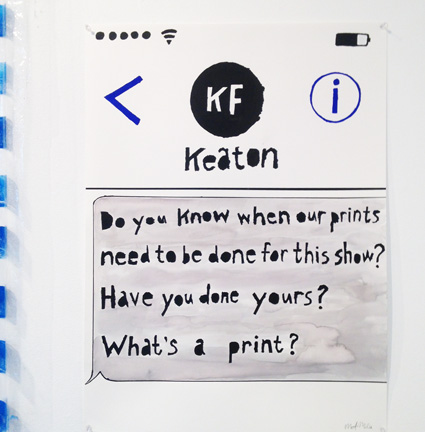
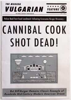
There are several artists represented  in Text/Image who are well known in Detroit for their absurdist take on the news and pop culture, using the vocabulary of comics and newspaper to communicate their point of view.  Ryan Standfest, gifted printmaker, founder of the Rotland Press and trickster artist, composes headlines for his imaginary tabloid newspaper the Modern Vulgarian (#1) that raise more questions than they answer and classified ads that go gleefully off the rails.

modern-vulgarian-1 (2)
The Modern Vulgarian #1 by Ryan Standfest

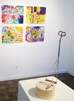
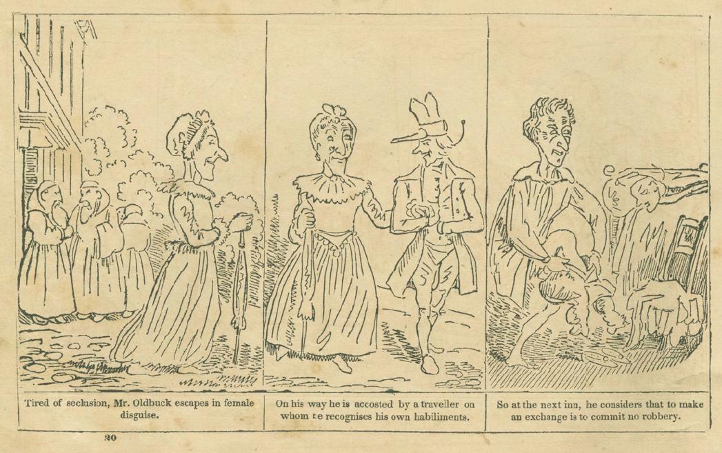
William Schudlich, illustrator and self-proclaimed “social zoologist” is clearly a kindred spirit.  Schudlich’s images  employ the visual vocabulary of disposable print media  such as comic strips and have the look of early to mid-20th century comics.  He approaches  visual challenges, he says, “with a dark sense of humor whenever possible.”  Tom Carey’s large relief prints, while ostensibly mining the same classic content as Schudlich and Standfest, project a more modern effect with their vivid colors and lively compositions. The small wooden mutoscopes (flipbooks in wooden boxes operated by pushbutton) created by Andy Malone also fit comfortably with the sensibilities of Schudlich and Standfest by appropriating of a vintage craft and  re-purposing it to make a modern statement.

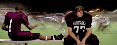
Two notable Detroit photographers, Christopher Schneider and Bruce Giffen, appear in Text/Image. In Schneider’s Underdog, the word “Hamtramck” printed on the young football player’s jersey adds context and pathos to the inward-looking figure, isolated as his teammate looks away toward the light and movement of the game. His fellow photographer Bruce Giffen, whose sharp and poetic eye is trained on Detroit at all times and in all seasons,  juxtaposes text with context for special resonance in his photo Stay In School.

t-i-Jaye-Schlesinger
Whole Foods by Jaye Schlesinger

Taurus Burns, Dencel Deneau,  Jaye Schlesinger  and Amy Fell all engage in the reification of the ordinary, each one observing with care and archiving with skill the unglamorous objects and often unsightly minutiae of the urban landscape.  Deneau’s small glass mosaics, in particular, are improbably lovely memorials to fleeting moments in the life of a city.

Moving from the grittily observational to the poetic,  Scott Northrup’s gauzy collages are cinematic and  nostalgia-soaked. Self-Portrait with Fruit by John Gutoskey is somehow both cheerful and sad,  and  recalls the innocence and the pain of a young boy growing up gay in the Midwest. Like Gutoskey’s quasi-installation, Believers by Catherine Peet hardly needs text to make its point, harking back to medieval altars of a pre-literate age.

t-i-deneau
School Bus by Dencel Deneau

Before the printing press and universal literacy, the visual impact of letters was as important as the narrative meaning.  Randy Asplund creates contemporary works using the same methods as medieval illuminators;  the pigments, grounds,  text and image are all carefully chosen for their symbolic resonance, each re-enforcing the meaning of the other elements. Taking the opposite tack, Alvey Jones subverts the meaning of text in Language Text and Circuit Board. Each element of the artwork is designed to be unintelligible–the book is (literally) Greek to us, the circuit board holds its meaning in a code we are unable to penetrate.

Barbara Brown, eminent Ann Arbor book artist and curator of a yearly survey of all things art and book-related, entitled Beyond Words, here uses her collection of handmade building blocks, Metropolis, to think playfully about the way reordering words or letters can alter narrative.

Text/Image can be understood best as a survey featuring a cast of accomplished artists, any one of whom could fill the gallery with well-crafted and well-thought-out work. The art in this exhibit thoughtfully uses language and image together to address  a variety of themes  from autobiography to social commentary, and while curator Jack O. Summers has put together an interesting and beautiful exhibit, the subject is far from exhausted and possibly never can be.

For more information about Text/Image go here


Printers without Presses

pp-milia
What’s a Print by Matthew Milia

In this dreary  and discontented winter season, Public Pool in Hamtramck aims to treat our tired eyes to Printers Without Presses, an exhibit of informal and mostly one-of-a kind printed artworks that “by hook or crook explore ingenious methods of printmaking.” This loosely organized collection of Public Pool regulars  (and their friends) showcases artists who are fully literate as conventional printmakers but who, for the purposes of this show, have discarded the more technical aspects of the printmaking process to create work that is  personal and playful.  Several of the artists are gifted  writers as well as visual artists, so text  and narrative content play an important role, resulting in  a roomful of fresh, unassuming and conversational artworks.

Chicago/Milwaukee artist and accomplished printmaker Tyanna Buie seems not limited but liberated by the simplicity of her means.  She employs hand applied ink, hand-cut stencils, collage and photo-based digital images to create Object and Ritual an ambitiously scaled, three-dimensional sculptural print that dominates the center of the gallery.

pp-terzieva
We Didn’t Start The Fire by Dessislava Terzieva

The seamless connection that the artists display between their online worlds and the lo-tech, hands-on life in the studio is striking.   Matthew Milia describes  “What’s a Print”, his hand-stenciled rendition of a cell-phone text complete with reception bars and battery status,  as an attempt to playfully “subvert the instantaneous, sometimes mindless facility modern technology has afforded correspondence.” Dessislava Terzieva freely admits her piece “We didn’t Start The Fire” is the result of an internet search.

Three of the artists share an interest in the urban natural world of Hamtramck and have clearly influenced each other.  In  Baby’s Breath and Obsolescence, Keaton Fox compares and contrasts the marks created by inked baby’s breath with the trail of a computer mouse as it is dragged along the surface of the paper. Teresa Peterson and Anne Harrington Hughes have each put together a collection of leaves which they have subsequently used to create print series that are visually related but thematically distinct.

pp-peterson
Situations with Mushrooms by Teresa Petersen

Jeffrey Evergreen and Bayard Kurth III rely on text to convey their colloquial content. Evergreen’s small printed brown bags fit seamlessly into the world of Hamtramck’s bars and he has humorously directed gallery visitors to take one but only “wrapped around a beer.”   In addition to  prints in the exhibit, Kurth has produced a zine “Improve Your Fishing” which establishes that he is a writer and thinker as well as a doodle-ist. Though not formally included in the show,  another zine Stupor/Soft Gun, part of an ongoing series by  Knight Fellow Steve Hughes and with illustrations by Alexander Buzzalini  (who is in the show), merits attention and you can buy it for the low, low price of $2.   pp-buzzalini-aje

More purely visual, as opposed to text-based,  pieces are provided by Jide Aje and Tim Hailey.  Although they trend toward painting with a more distant nod to printmaking, they  still fit within the rather loose parameters of the show and provide some nice shots of color.

Alexander  Buzzalini contributes a Giacometti-esque branding iron that somehow also recalls his characteristic gloppy painting style. This is accompanied by several branded discs that might be coasters, and the whole thing ties in  with his ongoing interest in imagery of the mythic old West. For more about Alexander Buzzalini you can go here to read an essay written (not too co-incidentally) by Steve Hughes, his collaborator on Stupor/Soft Gun. 

Like many of the non-profit art spaces in Hamtramck, Public Pool has limited hours, but it’s well worth your time and effort to see this work, on view until February 25. Artists in Printers Without Presses are: Jeff Evergreen, Jide Aje, Bayard Kurth III, Teresa Petersen, Alex Buzzalini, Mathew Milia, Tyanna Buie, Keaton Fox, Anne Hughes, Tim Hailey and Dessislava Terzieva. The gallery is open on Saturdays from 1 to 6.  For more information on Public Pool, go here.

Girlfriend Material

gfmbettygroup_big
Installation components from A Sucker for Jewelry

In Girlfriend Material, multimedia artist, writer and thinker Sarah Rose Sharp examines  the reductive archetypes that provide a distorting lens through which women are often viewed in American popular culture. She has gathered a small universe of cartoon females and set them up to play with and against each other, teasing out from these one-dimensional characters some three-dimensional thoughts on women and their place in the world.

A millennial feminist, Sharp is  aware that a multiplicity of roles are available to women but she also knows that female complexity and nuance are routinely flattened out and simplified in the popular imagination, the more easily to be consumed and digested.  And with the election of a known sexual predator and his cast of sexist cronies to the incoming U.S. administration, it looks as if Sharp’s observations are well calibrated to remain relevant for the foreseeable future.

“This show is a continuation of themes and ideas I’ve worked on for a very long time, but it’s been very much influenced by the recent climate surrounding the presidential election…we must really hate women for someone like Donald Trump to even have a chance, ” says Sharp in a recent Detroit Metro Times interview.

gfmfreehugs2
The Bitch is [IN]
The artworks and installations in Girlfriend Material seem to say that a woman can be a bitch or a doormat, a sexpot or a smart girl,  a princess or a goddess, as long as she doesn’t exhibit the complexity of a real woman. Modern society likes its female role models bite-size.

Sharp has elected to use only pop figures such as Wonder Woman, Betty Boop, Princess Leia, Lucy and Lisa Simpson in Girlfriend Material. She has limited her materials to mass marketed objects such as Pez dispensers, key chains, novelty fabrics and the like, altering and collaging them together to create imaginative games and transactional installations. While many of the artworks are playful, there is an unmistakable  undercurrent of frustration in this work, and an underlying question about how a woman’s life is defined by herself and by others.

gfmmeritbadge1
Miss Overachiever (detail)

Miss Overachiever, represented here by a manikin wearing a girl scout/Lisa Simpson beret and a comically over-loaded merit badge sash, is the good girl, the nerdy smart girl who gets all A’s, but is judged by the surrounding  culture in terms that value appearance and popularity over achievement. Or as Sharp says in her statement “Where is the line between smart and too-smart-for-your-own-good?”

The Betting Pool, a circular “game”  with no start and no end, continues the theme of cultural stasis. The glassy surface features bodiless characters in kiddie cars bumping and shuffling against each other, their movement controlled by an unseen motivator that flies  overhead. Who “wins” is determined not by the players but  by gallery visitors who bet on the character they “like” the best.

The sexy but infantilized  Betty Boop in  A Sucker for Jewelry illustrates yet another kind of game that women are sometimes called upon to play with mixed success. Her 1930’s persona has been lovingly updated with tattoos and bondage gear.  (Sharp found the keychain figures in an alley and has not altered them.) Why objects like this even exist is a mystery to the artist–and to us–but she suspects that Betty Boop’s  child-like head on her sexpot body still has plenty of cultural resonance. “I didn’t make this stuff up,” she says, laughing.

It didn’t escape my attention that many of the artworks in Girlfriend Material had a monetary component.  While Sharp may be complaining about the paucity of complex roles available to women, she seems also to imply that any choice a woman makes  is likely to be poorly compensated. Women still earn only 80 cents on the dollar in 2015 as compared to men, and women in the arts are not doing any better (and possibly worse). To cite a common art world benchmark, in 2015 only 8% of the contemporary art for sale at auction was by women. It should be no surprise, then, that Princess Leia is crowdfunding her rescue at 25 cents a pop and Lucy is willing to empathize for a nickel. It’s the going rate.

srsweddingring
Double Wedding Ring


In Double Wedding Ring, Sharp finally attempts to synthesize all of the oversimplified traits displayed by her characters into a more  complex picture. The kaleidoscopic collection of images in the quilt, meeting and circling each other, insists that a woman can be sweet and bitchy, strong, smart and sexy and quite a few other things if the surrounding society will only give her a shot. And in other corners of the culture, especially in film and television, there seems to be some movement toward more complex female characters.  Television shows like Lena Dunham’s Girls and movies like In  A World (directed by Lake Bell)  and the recently released Certain Women (directed by Kelly Reichardt) are carving out cultural space for actual women telling actual stories. Comedians like Amy Schumer and Samantha Bee bring humor to the public discussion of feminism.

So there’s hope, even if recent political events might indicate otherwise. It should be noted that all of the films and television shows I listed above are written and/or directed by women. Maybe by the time women reach wage parity with men (in 2152 at current rates!) we can look forward to equal rights  in gender roles too.

Girlfriend Material is on view at Public Pool, in Hamtramck until December 17, 2016.  For more information go here

The Art of the Story

Comics Unbound, an exhibit that examines the art and the craft of the comic, is on view right now through June 24 at Ann Arbor Art Center’s Gallery 117. The show  aims to illustrate the process through which comics, both in short and longer form, are created.  It “reveals what is usually an invisible narrative in comics–the journey from artist’s vision to clear transmission of meaning. ” according to jurors and comic artists Jerzy and Anne Drozd. The exhibition contains original drawings by cartoonists who will appear at the Ann Arbor Comic Arts Festival to be held at the Ann Arbor District Library, June 18 and 19, 2016.

oldbuck-mid-narrative
The Adventures of Obadiah Oldbuck

Ever since humans began making marks on flat surfaces, visual storytelling and the interplay between picture and text  has been an important part of western art history.   From neolithic cave painting  to Egyptian hieroglyphs to medieval panel painting, the extent to which pictures and text cooperate to tell a story has  depended on the literacy (sometimes more, sometimes less) of the general population. The invention of movable type in the mid-15th century in Europe revolutionized literacy and consequently, visual storytelling. Once most everyone could read, the path was paved for the first comic book, generally thought to be The Adventures of Obadiah Oldbuck in 1837. From there the scope and reach of comics has only increased, until now there is a whole section in the New York Times Review of Books devoted to graphic media. Numerous superhero movies based on comics  appear every summer  and Fun Home,  a musical adapted from a graphic novel is currently running on Broadway.

comic 1 rafael rosado
Dragon Beware by Rafael Rosado

Rather than dwelling on the history of comics though, this exhibit is organized to convey an idea of  how comics  are produced: from script and hand sketched storyboards, to drawing and coloring of the finished comic, with  printed versions also on display. The show also gives a fair idea of the range of subject, mode of visual expression,  variety of intended audience and level of literary ambition currently available to this medium. The pictorial styles on display range from the intentionally rudimentary but elaborately composed stick figures of Matt Feazell’s Too Much Help to the the 1950’s-retro washy ink drawings of  Apooko by Mike Roll to the classic super-hero comic style of Tom Mandrake in Creeps.  The subjects likewise range from personal  and autobiographical (El Deafo by Cece Bell) to comic myth (Dragons Beware by Rafael Rosado) to historical (Feynman (Tuva) by Jim Ottovani and Leland Myrick ).  And the literary language from one comic to another  is just as varied  as the pictorial expression.

comics 11 mat feasell too much help
Too Much Help by Matt Feazell

All of the artists in Comics Unbound display impressive levels of drawing ability personal to their individual style and loads of storytelling originality. A particular favorite of mine was Old Man, Dog and the Ocean by Emily Zelaszko. Her drawings are deft and idiosyncratic and her compressed language rises to the level of poetry. I also especially liked Mike Roll’s Apooko drawings and Carolyn Nowak’s Nichols Arboretum  but this probably reflects my own personal taste for certain drawing styles rather than any defensible aesthetic preference.

The conclusion I draw from Comics Unbound is that comics,  while they contain visual media, are not primarily a visual art. Rather they are more literary in nature, with visual augmentation, and their narrative strengths lie mostly in the area of dialog.  This might explain the frequency with which comics are developed into movies.  The storyboards in this exhibit certainly have a cinematic quality.  It seems to me that as an art form graphic novels and comics have most in common with  theater and film. They are meant to be consumed as literature or performance, rather than to be contemplated as fine art paintings and drawings.

comics 4 zelasko old man, the dog and ocean
Old Man, Dog and the Ocean by Emily Zelasko

The great advantage of comics over film however, is in the personal nature of their content and the relative ease with which the artist can translate private stories and concerns into a public medium without the necessity for elaborate technical support. The comic artist can, literally, express on the page anything she/he has the imagination to invent and there are far fewer practical barriers to self expression than in more public media like theater or film. The artists in Comics Unbound make full use of the broad scope of visual and literary expression that the medium offers them.

Artists in the exhibit include: Mike Roll, Emily Zelasko, Rob Stenzinger, Carolyn Nowak, Zack Giallongo, Cece Bell, Rafael Rosado, Ben Hatke, Ruth McNally Barshaw, Samantha Kyle, Cyndi Foster & Jeramy Hobbes, Jim Ottaviani, Matt Feazell, Dan Mishkin & Tom Mandrake.